Posted by Ecommersify on Oct 22nd 2026
Choosing a Stain: Color, Grain and the Wood Underneath
Hardware & Finishes
Choose a stain on the wood you intend to order. The color name alone cannot predict the final appearance because the wood contributes its own color, grain and variation. A stain sample on oak answers a different question from a sample carrying the same name on cherry or maple.
The most useful first decision is whether you want the grain to stand out, sit quietly in the background or fall somewhere between those extremes. That gives your search a purpose before you begin comparing dozens of appealing color names.
Read a sample as wood plus color
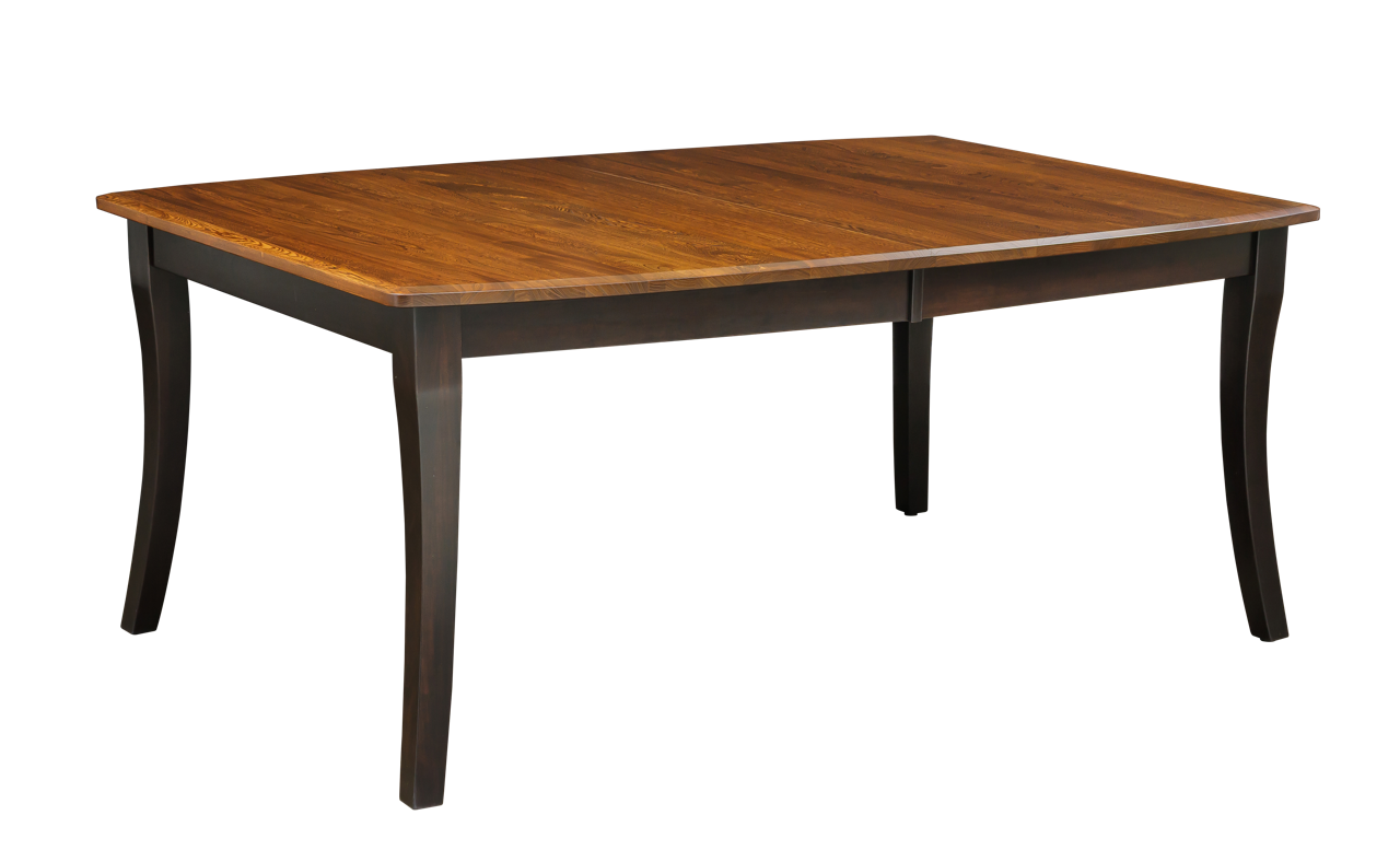
Look at the lightest and darkest areas of the sample, not only its average color. Notice the grain lines, small changes in tone and how the surface reflects light. Those differences help you imagine how the finish may look across several boards in a tabletop or across a large dresser front.
A small sample cannot show every board that will be used. The manufacturer specifically notes that natural wood variation remains visible and that a natural finish displays that variation. Choose a species and character level you like as a material, rather than expecting the stain to make each board identical.
Compare undertones against permanent surfaces
Bring a flooring sample, cabinet offcut or photograph used only for context into the comparison. Better still, put the actual furniture sample in the intended room. Warm reddish or golden notes can relate differently to a gray tile floor than to an oak floor. Darker does not necessarily mean cooler, and lighter does not necessarily mean neutral.
Avoid comparing one stain alone. Place two or three candidates together and differences become easier to see. First compare them against a plain background, then against the room's fixed materials. This separates the sample's own character from the influence of nearby colors.
Evaluate the room at the times you use it
A dining room seen mainly under evening lights deserves an evening sample check. A desk beside a bright window deserves a daylight check. Move the sample through the room and rotate it. Horizontal light on a tabletop can read differently from light on a vertical cabinet door.
Screens are helpful for narrowing the field, but they introduce camera, lighting and display differences. A photograph taken in a bright showroom should not become a promise of how the finish will appear under warm bulbs in a shaded room. Use images to identify a direction and a physical sample to judge the relationship with your surroundings.
Choose contrast deliberately
A room does not require one wood color everywhere. A table can stand apart from the floor while relating through warmth, grain character or surrounding textiles. Contrast can help the table remain visually distinct instead of disappearing into a broad expanse of similar flooring.
When adding a piece beside existing furniture, decide whether you want coordination or an attempted match. Coordination allows enough difference to look intentional. A close match is a more demanding task, especially when the existing furniture has aged or its original wood and finish are unknown. Start with a sample comparison rather than choosing the nearest online name.
Keep stain, texture and distressing separate
A stain color can be offered with different treatments, and the same treatment can change how the color reads. Glaze may emphasize details; decorative wear can expose contrast; a textured top changes shadows. If you like a photograph, identify which of those factors produces the effect you like.
Request a sample representing the complete proposed finish where available. A smooth sample of the base stain cannot fully demonstrate a rough-sawn top, and a small flat sample may not show how glaze collects around a molding. Look at both material samples and accurate examples of the selected treatment without confusing one for the other.
Use the wood-specific palette
Lancaster Legacy organizes its published stain choices by wood. That structure matters when comparing the options on a product page. A familiar color name in one group does not establish every possible pairing, and a special request should not be treated as a standard choice until it is confirmed.
The manufacturer price list also distinguishes standard selections, OCS colors and custom matching. For a custom match, the reference information and any required physical sample are part of the process. A stain brand, name and number are clearer than an informal description such as medium brown. Price and availability should be settled for the actual item before the order is finalized.
Finish with a practical comparison sheet
For each finalist, note the wood, stain code, finish treatment and what you liked in daylight and evening light. Add a brief reason to reject a sample as well. This stops you from circling back to the same unsuitable choice when online pictures look attractive again.
Choose the combination that works with the room and the amount of natural variation you enjoy. Keep the approved sample information with your order records. If you later add chairs, a cabinet or a second table, it provides a more useful starting point than memory or an old phone photograph.