Posted by Ecommersify on Oct 22nd 2026
Plan a Furniture Finish in the Right Order
Hardware & Finishes
A finish is easier to choose when you stop treating it as a single color. The finished appearance combines the wood, the color applied to it, any decorative treatment, the surface texture and where each color is placed. Choosing those layers in order helps you understand a sample and avoid a collection of options that works less well together than it did separately.
Begin with the furniture's job and the room it will occupy. A breakfast table used for writing has different surface priorities from a display cabinet. A piece beside a heavily patterned floor may benefit from restraint, while a plain room may welcome more visible grain or texture.
Decide how much wood character you want to see
Wood species is the foundation of the result. A transparent color leaves grain visible; opaque paint shifts attention toward silhouette and detail. Rustic and other character selections may emphasize natural variation. A sample represents a finish on a particular wood, not a universal color transferable without change to every species.
Put the candidate samples beside the fixed surfaces in the room: flooring, counters, built-in cabinetry and stone. These are usually harder to change than cushions or a rug. Decide whether the furniture should blend quietly with those surfaces or stand apart. You do not have to make the table match the floor exactly, but an intentional relationship is easier to live with than an almost-match you continually notice.
Choose stain or paint for a clear reason
Stain is useful when the grain itself is part of the design. Paint is useful when you want a more continuous field of color or want the furniture's outline to lead. Neither choice erases the need to evaluate the actual wood and construction. A painted solid-wood piece can still reveal its material through texture, joints and normal seasonal response.
The manufacturer publishes different stain selections by wood species and separately lists paint colors. Use the palette tied to the selected material. A color name found on a different product or wood is a starting point for discussion, not proof that the same combination is available on your chosen piece.
Keep color and treatment separate
Aged, antiquated, glazed and rubbed-through appearances describe treatments rather than just hues. Two samples with similar base colors can look very different when one has stronger edge wear or tonal emphasis in details. Ask yourself whether you like the underlying color, the treatment, or both.
The current supplied manufacturer price list distinguishes several finish packages and lists Antiquated as an additional treatment. Because the charges and applicable combinations belong to the selected product, compare the final configuration rather than assuming that all decorative appearances carry the same price. Color, surface work and a wood-species change are separate decisions.
Consider what touches the surface
A smooth tabletop makes a simple writing surface and is easy to scan for crumbs. Hand-planed or sawn textures can bring a different visual character, but you should inspect how the treatment feels and how you expect to use it. A groove may be attractive while making a placemat, writing pad or cleaning routine more relevant to daily use.
Surface options are model-specific. Seeing a hand-planed table in the catalog does not mean that every table, cabinet top or chair seat has that option. Look at the named surface treatment in the chosen item's controls and ask to resolve any difference between the picture and the offered specification before placing the order.
Map any second color to exact parts
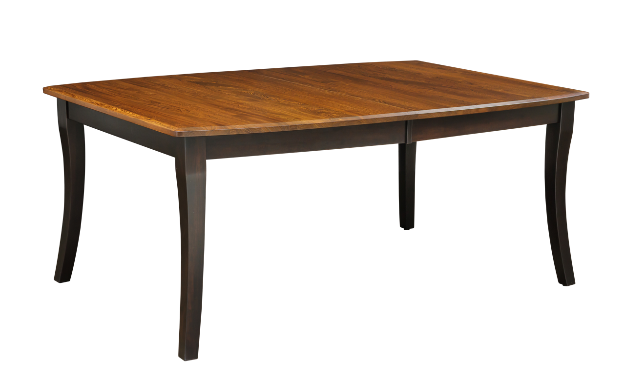
For a two-tone piece, write down where each color belongs. On a table this might be top versus base. On a chair it might be a seat and the remaining frame, subject to that model's construction. A vague instruction such as black and natural leaves too much unresolved.
A different color is not the same as a different wood species. A stained top and painted base may use the same wood; a contrasting-species top is another manufacturing choice with its own eligibility and price. Keep those requests separate when you compare options. This distinction is particularly useful when a photograph combines several attractive upgrades.
Make a small room palette
Limit the initial decision to two or three complete combinations. For each, place wood, color, upholstery and hardware references together. Look at them in daylight and under the lights used at dinner. View the samples vertically as well as horizontally when the furniture has both a top and a broad cabinet front.
Consider the largest surface first. A tabletop or dresser front will influence the room more than a small pull. Once the broad color relationship works, use the smaller details to support it. This prevents a favorite hardware finish from dictating an otherwise unsuitable wood color.
Keep a final finish record
Save the selected wood name, finish name and code, treatment, texture, placement and sample reference with the product model. Record whether the photograph shows the selected combination or serves only as a design example. This makes it easier to confirm the order and compare future additions.
The useful outcome is a precise, readable specification that also looks good in your room. You should be able to describe the piece without relying on a screenshot: its wood, its color, the surfaces receiving that color and any additional treatment. That clarity is as valuable as the initial inspiration.