Posted by Ecommersify on Oct 22nd 2026
Two-Tone Furniture: Plan Color Placement Before Choosing the Pair
Hardware & Finishes
Two-tone furniture works best when each color has a clear role. One can emphasize the top, another can connect the base to the room, or a selected component can provide a controlled accent. Begin by deciding where the contrast belongs before choosing two attractive color names.
A two-tone finish is different from using two wood species. The same wood can receive two colors, while a contrasting-species top changes the material as well as its appearance. Keep those decisions separate so the order and price are clear.
Choose the part you want to emphasize
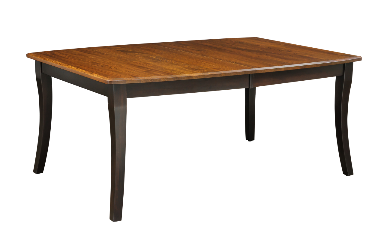
On a table, contrasting the top and base can make the top read as a distinct surface. On a cabinet, a different top color can connect the piece to other wood furniture while the body relates to painted cabinetry or trim. On a chair, the available placement depends on the model's construction.
Look at the furniture's proportions. A narrow accent has a different effect from changing the color of most of the piece. Decide whether the contrast should be strong and graphic or quieter and closer in tone.
Use the room as the reference
Identify the permanent colors around the furniture: flooring, counters, cabinets, walls and major upholstery. Choose which one the base or body should relate to and which one the top or accent should complement.
You do not need an exact match to create a connection. A deliberate relationship in warmth or contrast can work well. If you are trying for a close match, compare physical samples together in the room. Two similar colors viewed separately online are an unreliable basis for that decision.
Compare the complete material combinations
A stain sample on one wood does not establish how it will look on another. Place the selected top and base samples together on their actual proposed species. If both components use the same wood, record that clearly as part of the specification.
If the design requires different woods, confirm the eligible pairing and its current price before treating it as a selectable upgrade. A color-placement option does not authorize a mixed-species construction, and a general percentage note does not by itself resolve every possible custom combination.
Write a placement map
Use component names rather than a vague phrase such as black and brown. A table instruction might identify top and base separately, but whether the apron belongs with one or the other should be clear in the offered option. A chair may require more specific distinctions among seat, frame, top board or other parts.
The exact model controls which placements are available. Do not transfer the layout from a different chair or cabinet simply because the colors look attractive. Check the active choices and any placement diagram or written description.
Keep decorative treatment consistent with the plan
A color pair can also involve glaze, distressing or other treatments. Decide whether both areas receive the same treatment or whether the contrast includes a difference in finish character. The complete package should be named, not inferred from a photograph.
A smooth stain and a heavily treated painted surface can produce more visual contrast than their color samples suggest. Compare a representative finish example where available. If the room already has strong grain and pattern, a simpler two-tone combination may be easier to coordinate.
Check the price at component level
The manufacturer schedule distinguishes two-tone charges by furniture type and construction. It does not support a universal claim that every two-tone arrangement is free or carries the same surcharge. Tables and particular chair arrangements may follow different rules.
Use the final configured price for the selected product. Keep wood changes, color placement, decorative treatment and surface texture separate in the comparison. That makes it easier to understand why two visually similar examples can have different totals.
Imagine the repeated effect
A two-tone chair repeated around a table creates a stronger pattern than a single chair sample. A contrasting top on a long buffet creates a broad horizontal line. View the group at room scale before making the choice.
If the result feels too busy, reduce one source of contrast. You might keep the chairs in one finish while using two colors on the table, or choose quieter hardware on a two-tone cabinet. The aim is a clear hierarchy of details rather than contrast everywhere.
Preserve the final specification
Keep the model number, wood for each component, finish names and codes, treatments and placement map with the order. Note whether the product photograph shows your exact combination or simply illustrates the design.
A successful two-tone choice is both visually coherent and easy to describe. When everyone can identify which material and finish belong on each part, the design becomes a precise order rather than an interpretation of a picture.